It’s hard to believe it’s been almost a year since my debut novel – Haunters – was published. Now the book is beginning to appear in other countries — some with that distinctive British cover, and some with a different cover altogether – I though it would be interesting to compare how different publishers have interpreted the book. Especially as the three covers I’ve seen so far are so very different from each other.
Haunters in the UK (and Australia and New Zealand)
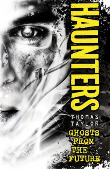 I was impressed by this design the moment I saw it. I felt the designer (the brilliant Steve Wells) had found a striking way to evoke the ghostliness of the story whilst still hinting that something other than a conventional ghost story would be found between the covers. If it’s true that a good cover tells you not just what a story is about but also how a story will feel, then I think this is successful. The acid yellow text in a band down the side wraps the whole thing up nicely, but in a way that’s also unsettling.
I did have some initial concerns that the skull didn’t read very clearly through the boy’s face – it looked more like someone wearing glasses – but I can see that this is about the best that can be done without using some very expensive printing technique.
Haunters in the US
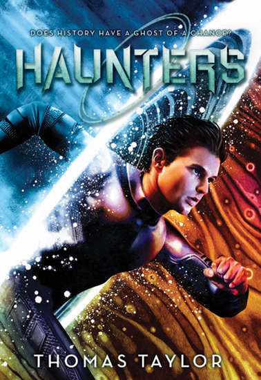 When I first saw this, I was taken aback by just how differently Scholastic had chosen to brand the book. Here we’re firmly into the realms of action, adventure and sci-fi, with strong hints of Back to the Future or the film Jumper. Not that any of this is inappropriate – the book is certainly all these things. This is a great cover image (by the award winning illustrator John Picacio), and one that should play well with the core readership (10+, mostly — though I hope not exclusively — boys). I can’t wait to see a copy of the book in my hands. The best way to account for the wide difference between the US and UK covers is to say that the book draws on a very broad base for its inspiration, with traditional ghost story themes woven into those of time travel and dreamwalking.
I have no real criticisms, but the blue of the title blends into the blue of the background in a way that makes it hard to read. This does have the effect of creating an iconic, textless cover image viewed from a distance, though, which is striking. But personally I would have expected the text at the top to pick up red/orange/pink tones from the colour elements in the bottom part of the image.
Haunters will be published in the US next month, in hardback initially. I’m looking forward to getting feedback from readers there on the cover, as well as the story itself (I’ve already been shown a good Kirkus review). Keep your eye on this blog for a giveaway in the next few weeks.
Haunters (Dromenjagers) in the Netherlands
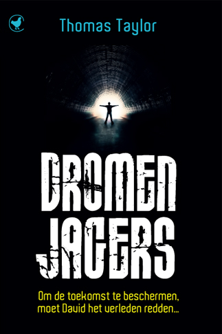 Here we’re different again, with a cover that is very dark and contrasting. And if the UK version emphasises the ghosts, while the US one the time travel, then the Dutch publisher, The House of Books, have gone straight for the dreamwalking/near-death/out-of-body aspects of the story. And I’m pleased because these were precisely the elements that were strongest in my mind when I wrote Haunters. The fact that the ‘light at the end of the tunnel’ motif also looks like an unblinking eye (an image used in the book) is a really nice touch.
Using a lot of black does have its risks though, and the Dutch edition certainly isn’t as eye catching as the British or American ones, but once spotted, I believe the cover is more than intriguing enough to draw potential readers to at least read the blurb on the back. Let’s hope they want to read more.
Dromenjagers (love the title in Dutch!) is due out in September.
In conclusion, I have to say that – while I slightly prefer the UK cover overall – I’m delighted to see such strong visuals on my book. When I’ve seen more of the designs for the German and Spanish editions, I’ll update this post. I’m looking forward to that. In the meantime, please let me know what you think, and – of course — which is your favourite.
Like them all, but those Dutch, eh? Dark with a capital D 🙂
Nigra sum, sed formosa. As the man said…
They’re all fine images – but you know, I think I actually like the US one best. It really captures the idea of the novel I think.
Thanks, Simon. Yes, it’s a fine image. And the interior designed elements — based around concentric circles — work really well too.
As a female, I slightly prefer the Dutch – it’s fairly gender neutral as far as covers go, but it’s bold and symbolic, and it would have intrigued me age ten+ as much as it does now, I think, whereas the UK cover would have scared me off (even though I love it now). My daughter loved Haunters and told all her friends – male and female – to buy it – hope that helped!
It really pleases me to hear that your daughter liked the book so much, Rachel. I didn’t want Haunters to be quite so boy-orientated as it seems to have turned out (or at least been branded). I aspire to write books that have cross gender appeal, but — as I’m discovering with my current project — that is much harder than it should be.
I do think Haunters has lost a few sales due to the scariness of the UK cover. Certainly I’ve met people who told me they chose not to buy it for their child because of how it looked. But then, others have raved about it, and a few adults have been drawn to it who may never have picked it up if, say, it had always had the US cover. It just goes to show what a minefield book design is.